There’s a huge focus on “The 80’s look” in films today. It’s often achieved using neon lights casting strong shadows. It’s a cool look, I am a big fan of it but there’s something that also bugs me about how it’s often executed. It lacks motivations.
This is not referring to the motivation of the filmmaker or photographer. Often times, their motivations are clear and inspired by some amazing pop-culture. NERDVANA: The Web Series itself is motivated by comics, movies and other pop-culture.
I am referring to the motivation of light.
When I started making films, I would just blow out an image because I could. I had bought an expensive lighting kit and thought that more lights = more production value. How mistaken I was. My preliminary knowledge of three point lighting had me trying all sorts of things to make sure every inch of the frame was literally “lit AF.” The reason was because I knew how to three point light, I didn’t know why I was three point lighting.
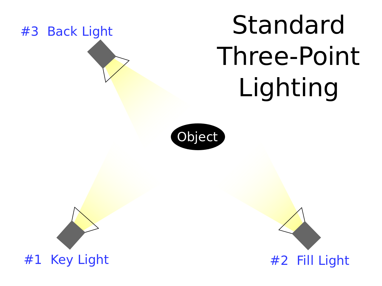
Three Point Lighting is considered the minimum basic lighting for film and photography. it consists of three lights around a subject arranged as such:
Key Light
Back Light
Fill Light
Key Light: This light is the main light that is usually positioned straight on your subject. Don’t make the same mistake as me and go into Vistek asking where they keep their “Key lights”
Back Light: This light is often used to outline your subject and give them shape and depth in the frame. Sometimes referred to as a rim light.
Fill Light: This light, also known as the motivated light, adds a final piece of dynamic range to the frame and literally fills in some of the unintended shadows the key or back lights missed.
Do you need all these lights? Besides a key light, the answer is… no
You, as a story teller, need the number of lights required to motivate the story in your frame. A key light is whatever the main source of light is for your subject. It doesn’t need to be a professional light but an image does need a light, even if it’s natural light. A back light will pop your subject from the background and a fill light will add motivation, but these last two are optional.
The distance of these lights also plays an equally important role, but I’ll get into that in a future post.
Lighting Credit: Rhett Miller
Going back to motivation for a moment and the lack there of. I would later learn, from the talented cinematographers that have inspired and mentored me, that all light requires motivation, that’s the magic trick of good lighting. A light source in or just outside the frame that can be explained in the narrative of the story. In The Good Survivor, the fire Dylan and Steve share did not emit enough light to their faces but we were able to use it as a motivator for the warm oscillating light used to light them off screen.
There are always exceptions. Indie Horror often has strong shadows out of low budget that work in the genres favor. One of my favorite movies “Creepshow” uses a lot of dynamic lighting that doesn’t always have a light source motivator in the frame; but I would argue that the tone of a horror comic book is plenty of motivation for such stylistic genre piece.
With amazing color grading tools available now, it’s easy to slap on some warm oranges and cool blues and assume that’s good lighting. It’s not, and you can only manipulate the information available, which is why it’s also important to understand your cameras ability to capture light and exposing to allow for optimal dynamic range.
A Key Light that is, or simulates, a sunset
A Fill light from a neon sign across from the subject
And a Back Light from a stop light behind the subject changing from Green, to Yellow, to Red
That’s what should at least come to mind when trying to generate “the 80s look”
Speaking of “80’s Look” Check out our latest Cosplay Video from the 2019 Calgary Expo featuring the song “Video Game Champion” by GUNSHIP


